Dialog Boxes
The dialogues are displayed on screen using dialog boxes. Sprouty Dialogs allows you to customize the appearance and behavior of these dialog boxes to fit your game's style. You can do whatever you want!
Using dialog boxes
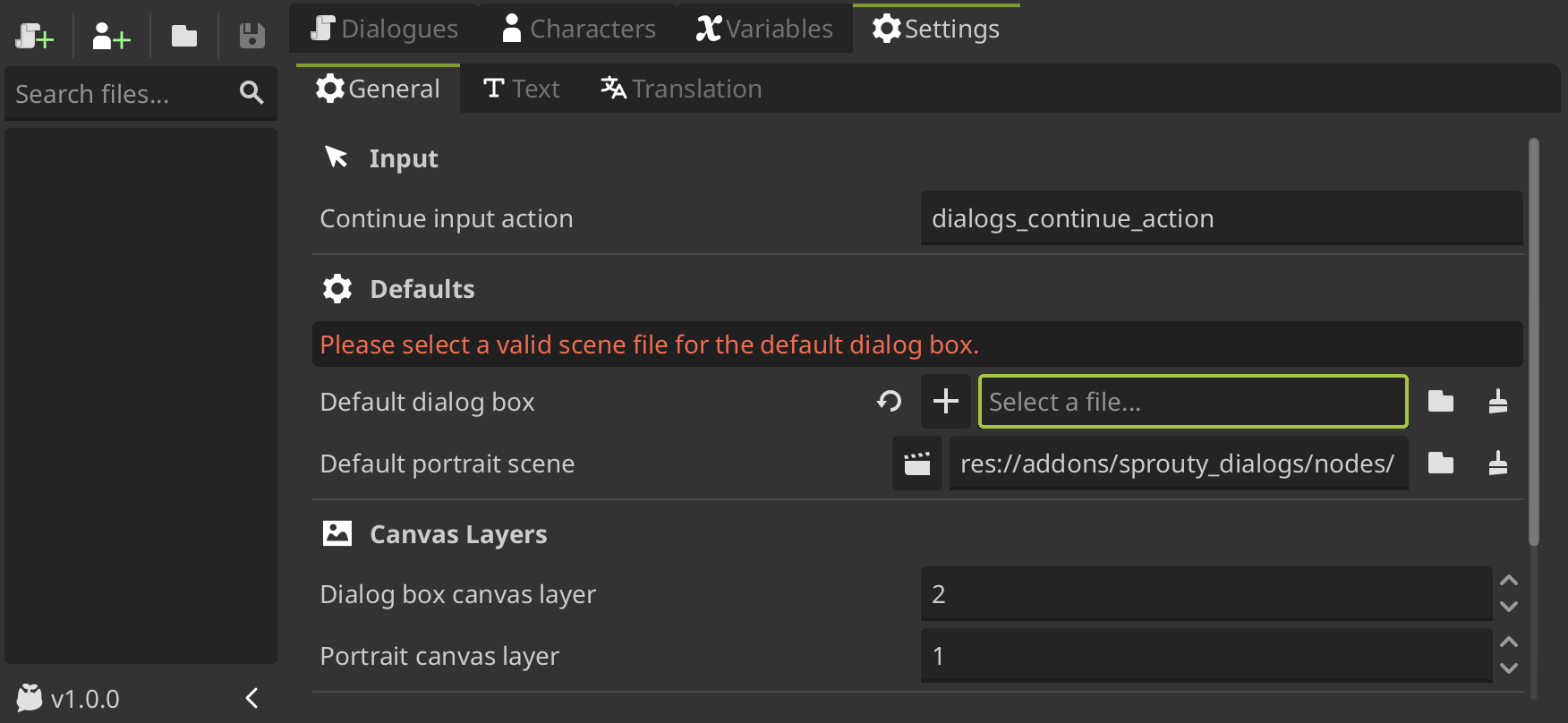
By default, there is a default dialog box that will be displayed for all dialogues. You can change this dialog box in the Default dialog box setting from general settings, selecting a existing dialog box or creating a new one.
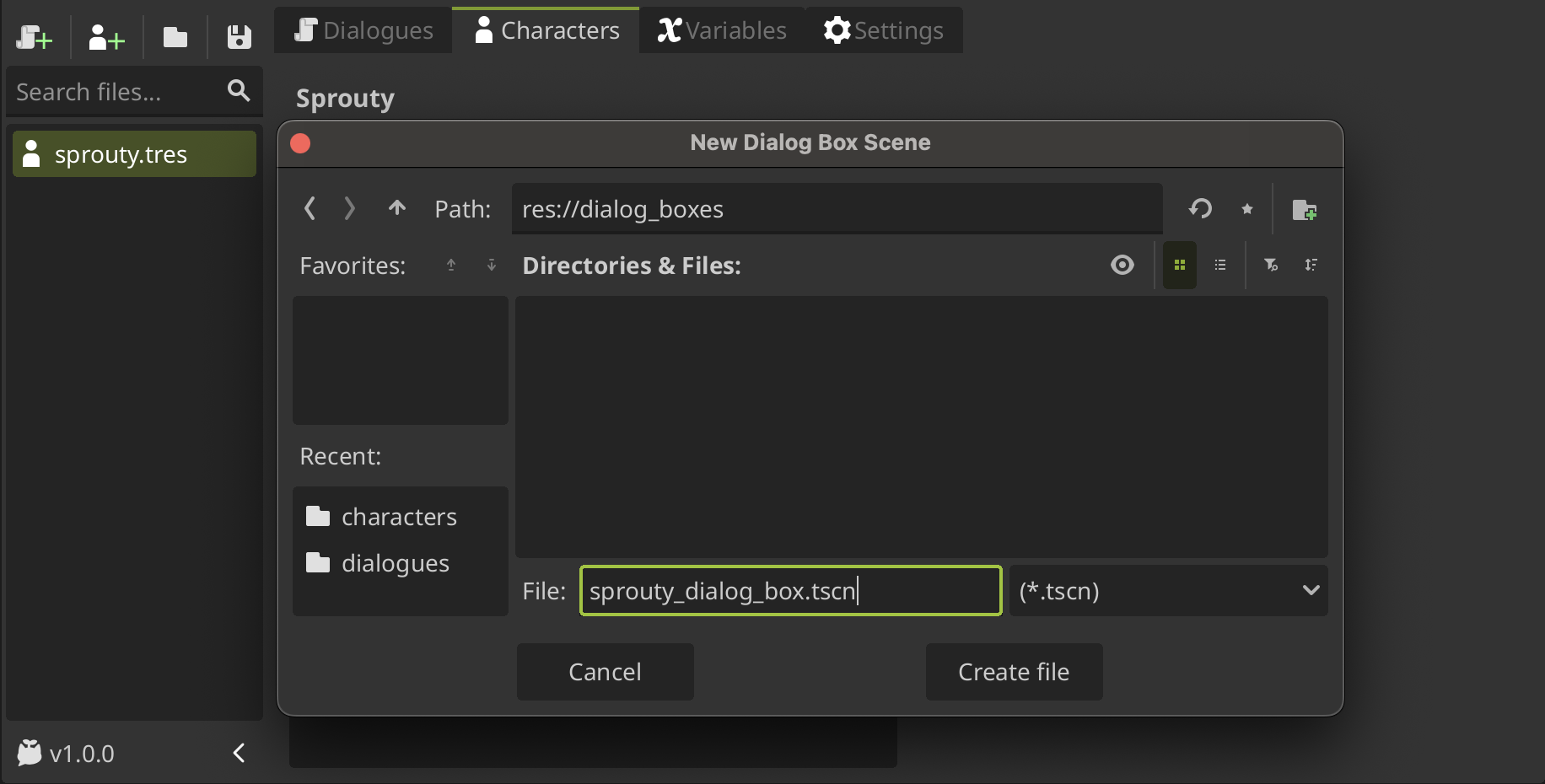
To create a new dialog box, clean the path in the field and you will see a + button, click it, locate where you want to save the file, give it a name and then click on Create File.
If you change the Default Dialog Box in the settings, this dialog box will also become the new template when creating a new dialog box.
You can also assign a custom dialog box for each character. With a character file open, you can create a new dialog box scene clicking the + button in the Dialog Box property, locate where you want to save the file, give it a name and click on Create File.
When you create a new dialog box scene, the scene will open in the editor for editing. This scene by default is a template with a basic dialog box layout.
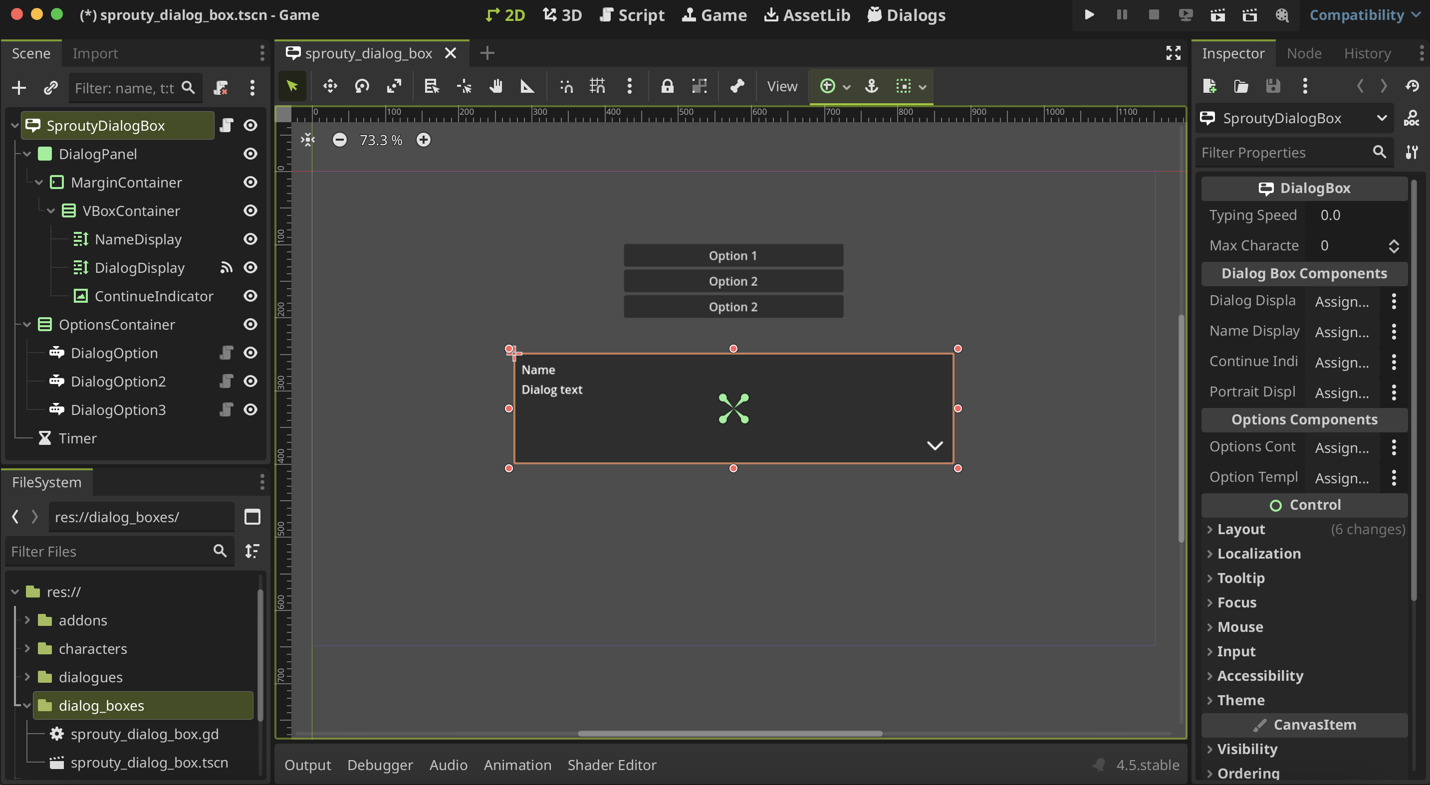
In the file manager, you can see that in addition to the scene, a script with the same name was created: sprouty_dialog_box.gd.
This script is a template that inherits from the DialogBox class, and you can edit it to customize the behavior of the dialog box. See more in Advanced Customization.
You can also create a dialog box from scratch using the DialogBox node as the root, but here we show you some easy ways to get started with a template.
Now, let's see how we can customize the dialog boxes!
Customize dialog boxes
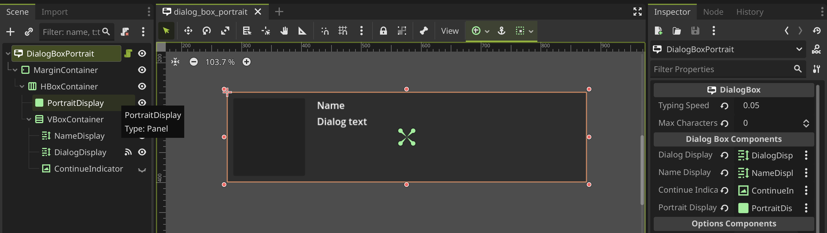
You will going to see that the dialog box node have some properties in the inspector. First of all, you can override the Typing Speed and Max Characters settings for a specific dialog box. If you don't change them, the default parameters from text settings will be used.
Also, there is a Dialog Box Components section, where some components are required. This components are:
-
Dialogs Display: RichTextLabel where the dialogue text will be displayed. This component is required to display the dialogue text in it. -
Name Display: RichTextLabel where character name will be displayed. If you want to display the character name in the dialog box, you need to set this property.ImportantThe RichTextLabel components need to have enable the
BBCode enabledproperty to display the text effects from the text editor. -
Continue Indicator: A Control node as a Visual indicator to indicate press for continue the dialogue (e.g. an arrow). If you want to display a continue indicator in the dialog box, you need to set this property. -
Portrait Display: A Node where the character portrait will be displayed (parent node). If you want to display the portrait in the dialog box, you need to set this property.
You don't need to use all the components in the template; you can configure your dialog box however you want. Just keep in mind that you need the components indicated in the inspector depending on what you're going to do.
For example, if you don't want to show the character name in the dialog box, you can not assign the
Display Namecomponent and the name will be not displayed.
Customize dialog options
Lastly, there is a Options Components section with the follow properties:
-
Options Container: Container where the options will be displayed in the dialog box. It is recommended to use a VBoxContainer or GridContainer to display the options. This component is required to display the dialog options in it. -
Option Template: Node that will be used as a template for the options in the dialog box. It should be a DialogOption node or a node that extends from it. This component is required to display the dialog options.
This components are not required only if you don't want to display options in the dialogue, what means that you are not going to use options nodes in your dialogue trees.
The DialogOption node extends from the Button class, because the options are clickeable, so they are basically buttons. The DialogOption node has two optional properties:
-
Text Display: A Label node. Assign this component if you want to use a custom simple label without text effects in the options text. -
Rich Text Display: A RichTextLabel node. Assign this component if you want to use a custom label that supports text effects in the options text. (BBcode enabled must be true)
If you don't assign any of these components, the option text is going to be displayed using the button text, so you have less customization.
Here is an example of a dialog box customized with custom components:
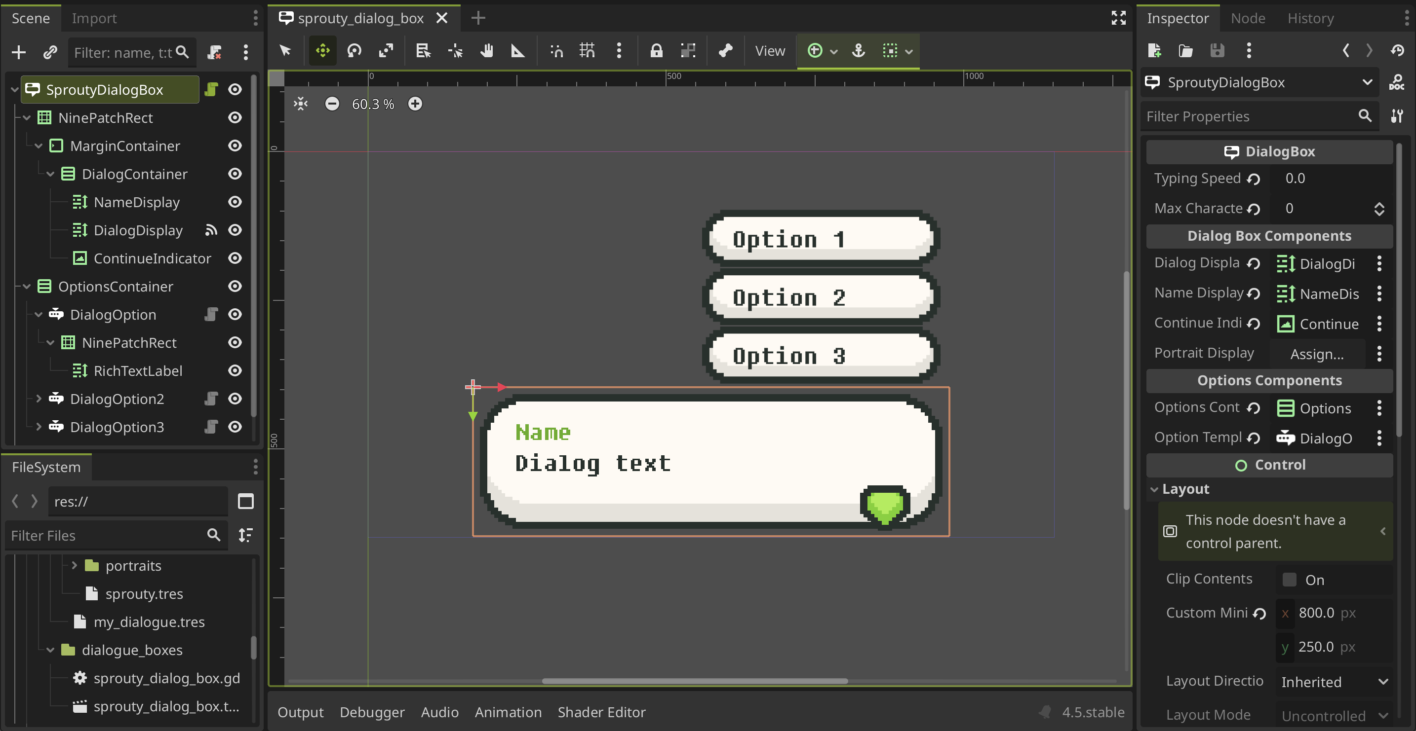
As you can see, in this case, the Portrait Display component is not used because this dialog box will not display any portraits in it. The same applies to the other components, except for Dialogs Display, which is a necessary component to display the dialogs.
Advanced Customization
When we create a new dialog box, a script with the same name is also created.
This script is a duplicate of the template script that extends from the DialogBox class, which allows you to customize the behavior of the dialog box. For example, to add animations when the dialog box open or closes.
You can use this script to override the following methods:
## Called when the dialog box is open at the beginning of the dialog.
## Override this method to customize the behavior of the dialog box when is open.
func _on_dialog_box_open() -> void:
    show()


## Called when the dialog box is closed at the end of the dialog.
## Override this method to customize the behavior of the dialog box when is closed.
func _on_dialog_box_close() -> void:
    hide()


## Called when the dialog options are displayed.
## Override this method to customize the behavior of the dialog box when options are displayed.
func _on_options_displayed() -> void:
    if options_container:
        options_container.show()


## Called when the dialog options are hidden.
## Override this method to customize the behavior of the dialog box when options are hidden.
func _on_options_hidden() -> void:
    if options_container:
        options_container.hide()
Using portraits in dialog boxes
In you want to display a portrait in the dialog box you need to set the Portrait Display component in the inspector. This component will be the parent node where the portrait is going to be added to the scene, so basically defines the position of the portrait on the screen.
Also, you need to enable the Portrait on dialog box property in the character that you want to be displayed on a dialog box. For more information see Characters & Portraits section.
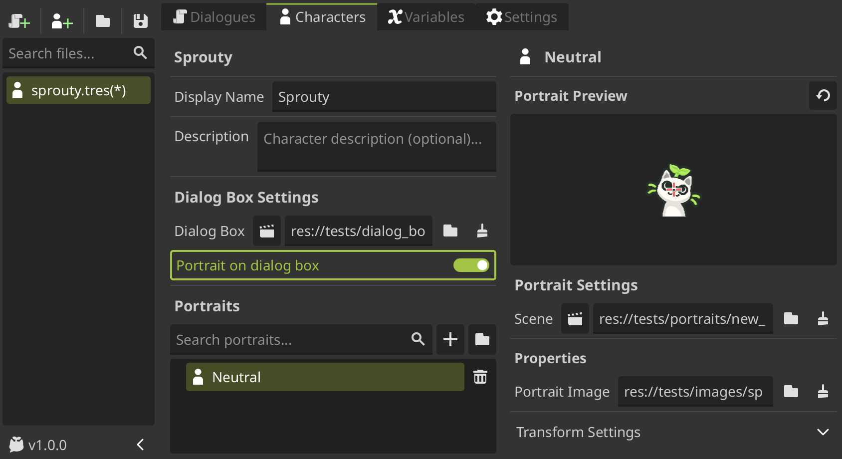
In this way, the portrait will be displayed in the dialog box when the dialogue is played.
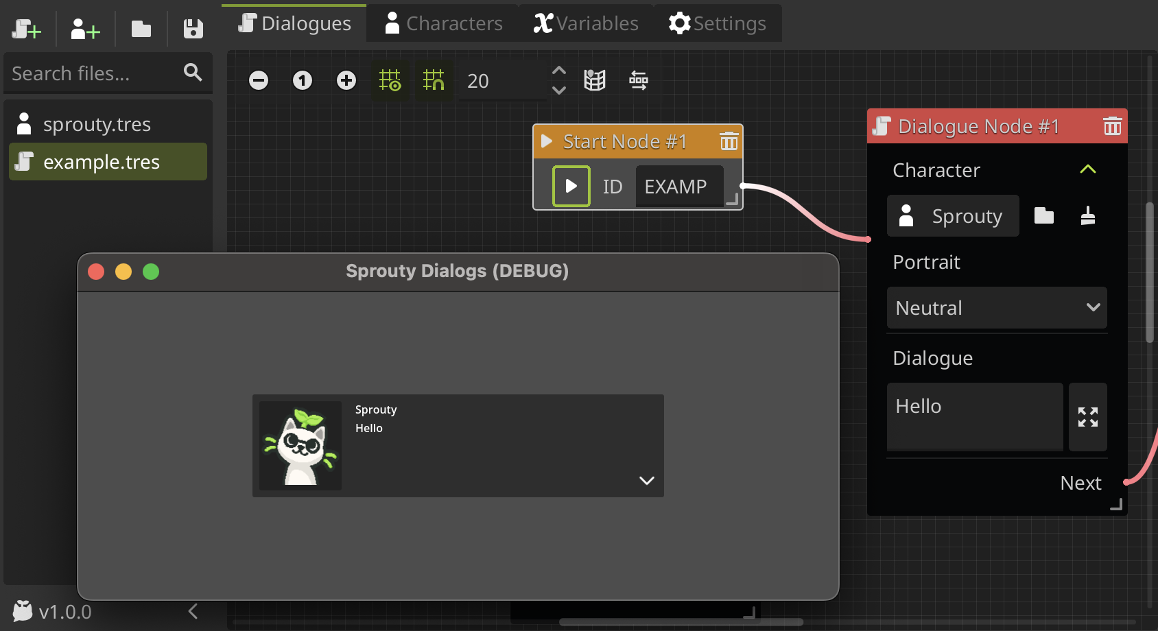
Remember that to use this dialog box with portrait display (or any dialog box that you want), you must assign it as the default dialog box or to the character whose portraits you want to display in the dialog box.